UI
UX
Animations
In collaboration with a Berlin-based agency, I worked on a concept to enhance Burger King’s digital ordering flow. Based on user research and identified pain points, I designed a smoother, more personalized interface aimed at improving both clarity and engagement.
UI
UX
Animations
In collaboration with a Berlin-based agency, I worked on a concept to enhance Burger King’s digital ordering flow. Based on user research and identified pain points, I designed a smoother, more personalized interface aimed at improving both clarity and engagement.

Navigation & Interactions
To improve clarity and hierarchy, I restructured the screen into three static areas: customization, order summary, and checkout. The existing interface was overloaded and confusing, so I removed unnecessary steps and introduced a simplified, motion-based navigation. Each transition is visually connected to the previous screen using animations, helping users understand where they are in the flow. Instead of fully switching views, the interface shifts and compresses, keeping users oriented throughout the experience.


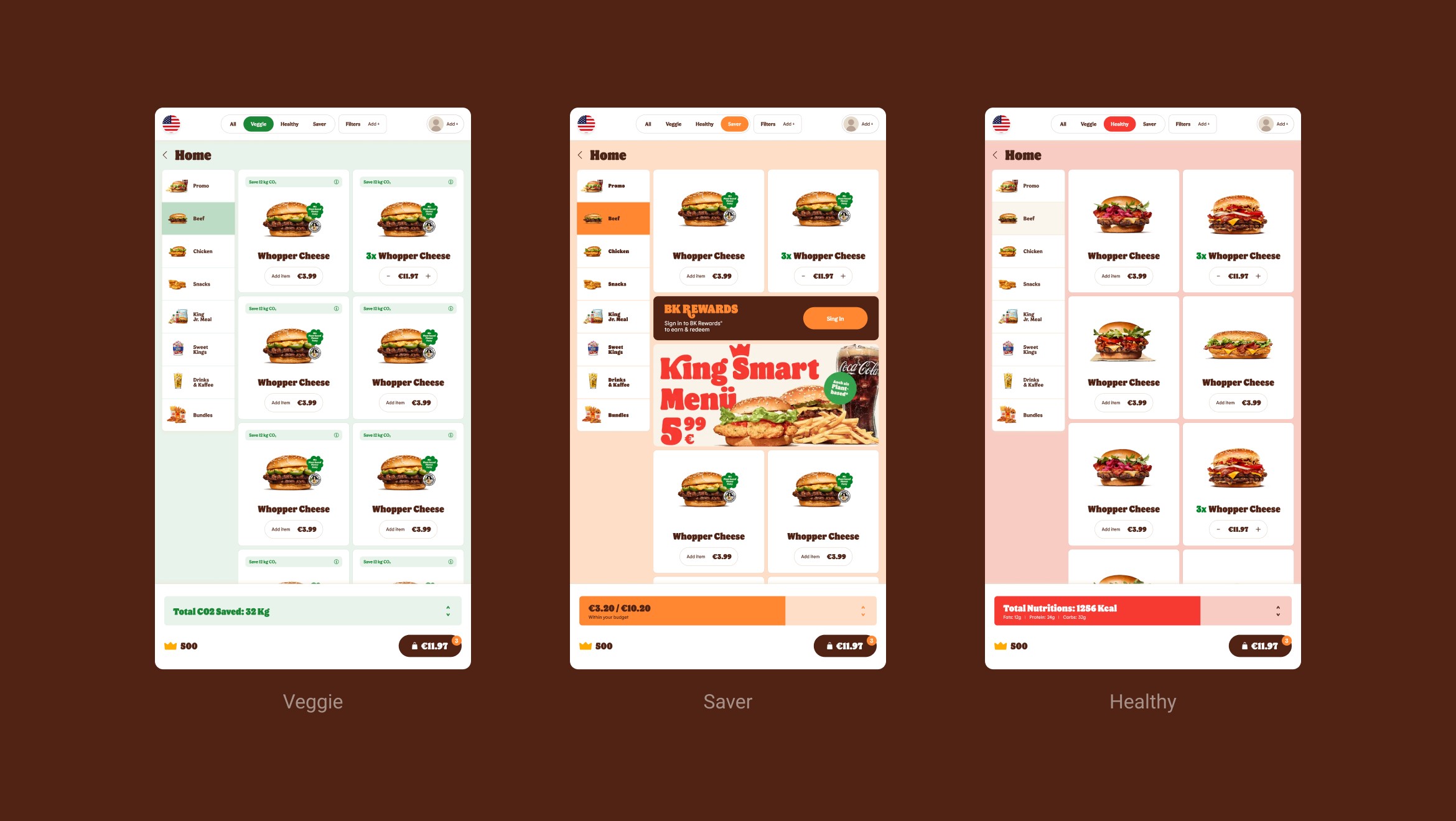
Personalization
Working closely with a UX researcher, I designed a more adaptive interface that responds to individual needs. Users can now quickly filter and customize what they see, choosing options like veggie, healthy, or low-budget meals. I also introduced a dynamic bottom bar showing live information such as calories, budget usage, and saved CO₂. For group orders, we added a feature that allows users to add multiple people and automatically separate their items into individual baskets. This made it easier to split and track shared orders in a single flow.