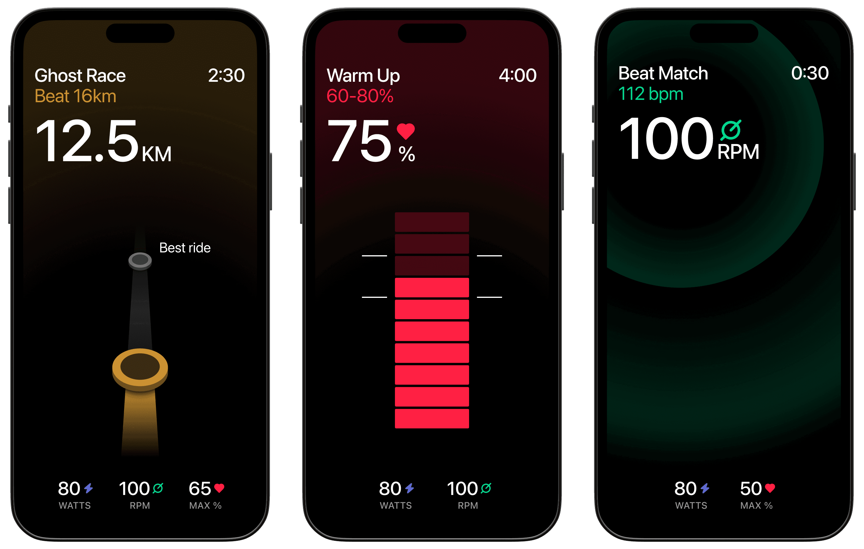
Brought in by the Berlin fitness startup to make their workout interface readable for first-timers, mid-exercise. The directions I explored are about how much a person can take in while moving, out of breath, glancing at a screen for a second: hierarchy, contrast, and a colour system for the metric types — heart rate, power, distance — so each one is recognisable before it's read. Full case study coming soon.